Content Management System (CMS)

Choosing the Right Content Management System (CMS) for Your Website: Fueling Your Online Success with 5 Core Functions

Choosing the Right Content Management System (CMS) for Your Website: Fueling Your Online Success with 5 Core Functions In this post, we will delve deep into the world of CMS i.e Content Management System , exploring its definition, functions, types, and why it is an indispensable tool for modern web content management. In today’s digital age, where information rules the world, the need for an efficient and effective Content Management System (CMS) cannot be overstated. The term “Content Management System” has become synonymous with the backbone of the internet, enabling individuals and businesses to create, organize, and publish content online seamlessly. What is Content Management System (CMS) A Content Management System, often abbreviated as CMS, is a software application that simplifies the process of creating, managing, and publishing digital content, primarily for websites. At its core, a CMS allows users, regardless of their technical expertise, to effortlessly manage the various aspects of their online presence. Whether you run a personal blog, an e-commerce platform, or a large corporate website, a content management system serves as the linchpin of your online strategy. The Core Functions of a CMS Content Creation: One of the fundamental functions of a CMS is content creation. Users can create and edit text, images, videos, and other multimedia elements directly within the system. This intuitive interface streamlines the content authoring process, ensuring that the end result is visually appealing and engaging. Content Editing and Management: A CMS allows for easy editing and management of content. This includes the ability to revise and update existing content, organize content into categories or folders, and set permissions to control who can access and edit specific content. User Management: CMSs enable user role management, which means assigning different levels of access to various users or teams within an organization. This ensures that content creators, editors, and administrators have the appropriate permissions to carry out their tasks. Workflow Management: Many modern CMSs offer workflow management features that facilitate collaboration among team members. Content can be reviewed, edited, and approved by multiple stakeholders before publication. Version Control: Version control is a critical feature that allows users to track changes made to content over time. This feature is particularly useful for maintaining a history of content revisions and for reverting to previous versions if necessary. Types of Content Management Systems Content Management Systems come in various forms, catering to the diverse needs of users. Here are some of the common types: Open Source CMS: Open source CMSs are free to use and offer a high degree of customization. WordPress, Drupal, and Joomla are popular examples. These platforms have a strong community of developers and users, resulting in a wide range of plugins and themes. Proprietary CMS: Proprietary CMSs are commercial solutions offered by companies. Examples include Adobe Experience Manager and Sitecore. These systems often come with advanced features and dedicated support but can be costly. Headless CMS: Headless CMS separates the content from the presentation layer, allowing content to be delivered to various devices and platforms. This flexibility makes it ideal for omnichannel content management. Cloud-based CMS: Cloud-based CMSs are hosted on remote servers and accessed via the internet. This eliminates the need for on-premises infrastructure and provides scalability and accessibility from anywhere. Self-hosted CMS: Self-hosted CMSs require users to manage their own server infrastructure. While this provides greater control, it also demands technical expertise. The Role of CMS in Modern Web Development The adoption of a content management system has become nearly ubiquitous in modern web development, and for good reason. Here’s why CMS is a vital component of contemporary online strategies: Ease of Use: Content management systems are designed to be user-friendly, reducing the barrier to entry for content creators and website administrators. With a minimal learning curve, individuals with limited technical expertise can quickly become proficient in managing their online content. Efficiency: CMSs streamline the content creation and publication process. Templates and predefined layouts simplify the design aspect, while content scheduling ensures that content is published at the right time. Scalability: As your website grows, so does your need for efficient content management. CMSs are highly scalable, accommodating the addition of new pages, features, and multimedia elements with ease. SEO Optimization: Many CMSs offer built-in tools and plugins for search engine optimization (SEO). This ensures that your content is structured in a way that is favorable to search engines, making it more discoverable to your target audience. Security: CMSs often receive regular updates and patches to address security vulnerabilities. Additionally, user access controls and permission settings help protect your content from unauthorized changes. Responsive Design: With the increasing importance of mobile devices, responsive web design is crucial. Most modern CMSs offer responsive templates, ensuring that your website looks and functions seamlessly on various screen sizes. Content Analytics: CMSs often come with built-in analytics tools or integrations that allow you to track the performance of your content. You can gain insights into user behavior, engagement, and other key metrics to inform your content strategy. Choosing the Right CMS Selecting the right content management system is a crucial decision that can significantly impact the success of your online presence. To make an informed choice, consider the following factors: Content Needs: Assess the type of content you plan to publish. Will it be primarily text, images, videos, or a combination? Some CMSs excel in certain content types, so choose one that aligns with your needs. Ease of Use: Evaluate the user-friendliness of the CMS. Is the interface intuitive, and does it match the skill level of your team members? Customization: Determine how much flexibility and customization you require. Open-source CMSs are highly customizable, while proprietary systems may have limitations. Scalability: Consider the growth potential of your website. Ensure that the CMS can accommodate your future expansion needs. Cost: Budget constraints are a significant factor. While open-source CMSs are typically free, proprietary systems and cloud-based solutions may come with subscription fees. Support and Community: Examine the availability of support and resources. A strong user community


Choosing the Right Content Management System (CMS) for Your Website: Fueling Your Online Success with 5 Core Functions Read More »

SEO Rank Tracking Tool

SEO Rank Tracking Tools: Your Key to Search Engine Domination with 7 main factors

SEO Rank Tracking Tools: Your Key to Search Engine Domination with 7 main factors In this post, we will explore the world of SEO rank tracking tools, how they work, and why they are crucial for your online success. In the digital age, where the competition for online visibility is fierce, Search Engine Optimization (SEO) has become the cornerstone of online success. Every business, big or small, strives to rank high on search engine results pages (SERPs) to attract organic traffic. However, monitoring your SEO performance and staying ahead of the competition can be a daunting task. This is where the invaluable SEO rank tracking tool comes into play, helping businesses streamline their SEO efforts, make data-driven decisions, and climb the SERP ladder. Understanding the SEO Rank Tracking Tool Before diving into the significance of SEO rank tracking tools, let’s clarify what they are and how they function. An SEO rank tracking tool is a software or online service designed to monitor the performance of your website in search engine rankings. These tools track your website’s position for specific keywords on various search engines, such as Google, Bing, or Yahoo. How Do SEO Rank Tracking Tools Work? Keyword Tracking: The core functionality of an SEO rank tracking tool is keyword tracking. You input a list of keywords or phrases relevant to your business, and the tool regularly checks where your website ranks for each of them. This allows you to gauge your website’s visibility for specific search terms. Competitor Analysis: Many SEO rank tracking tools offer competitor analysis features. They help you identify your top competitors and track their rankings for the same keywords. This information is invaluable for devising competitive SEO strategies. SERP Features: Modern SEO goes beyond traditional organic rankings. SEO rank tracking tools often provide data on SERP features, such as featured snippets, local packs, and knowledge graphs, to help you optimize for these opportunities. Historical Data: These tools maintain historical data, allowing you to track your website’s ranking progress over time. This feature helps you assess the effectiveness of your SEO efforts and identify trends. Local SEO: For businesses with a local presence, SEO rank tracking tools offer location-specific tracking. You can monitor how your website performs in local search results, making it essential for local SEO campaigns. Mobile Rankings: As mobile search continues to grow, tracking your website’s mobile rankings is crucial. SEO rank tracking tools often offer mobile tracking options to ensure you’re not missing out on mobile traffic. Why Are SEO Rank Tracking Tools Crucial? Data-Driven Decision-Making: SEO rank tracking tools provide you with actionable data. By knowing where your website stands in search results, you can make informed decisions on which keywords to target, which content to optimize, and which strategies to employ. Competitive Edge: In the competitive digital landscape, staying ahead of your competitors is vital. SEO rank tracking tools help you identify your competitors’ strengths and weaknesses, enabling you to fine-tune your SEO strategy for better results. Goal Tracking: Setting and tracking SEO goals is easier with these tools. Whether it’s improving your website’s position for specific keywords or increasing organic traffic, SEO rank tracking tools help you monitor your progress toward achieving these goals. Content Optimization: To rank well in search results, your content must be optimized. These tools highlight which pages need improvement and which keywords are driving traffic, allowing you to optimize your content effectively. Algorithm Updates: Search engines frequently update their algorithms, which can impact your rankings. SEO rank tracking tools help you quickly identify drops in ranking, allowing you to adapt your strategy to algorithm changes. Reporting and Insights: Many SEO rank tracking tools generate detailed reports and insights, making it easy to share progress with stakeholders and clients. These reports often include charts, graphs, and historical data to support your SEO efforts. Selecting the Right SEO Rank Tracking Tool Choosing the right SEO rank tracking tool is essential for the success of your SEO campaigns. Here are some factors to consider when selecting a tool: Accuracy: The tool must provide accurate ranking data. Look for a tool that updates rankings frequently and pulls data directly from search engines. Keyword Limit: Check if the tool has a limit on the number of keywords you can track. Ensure it can accommodate your needs. Competitor Analysis: If competitor analysis is crucial for your strategy, choose a tool that offers robust competitor tracking features. User-Friendliness: The tool should be user-friendly, with an intuitive interface that allows you to access and interpret data easily. Historical Data: Make sure the tool stores historical ranking data so you can track your progress over time. Reporting: Consider the reporting capabilities of the tool. Look for customizable reports and the ability to schedule automated reports. Price: Budget is a significant consideration. Compare the pricing plans of different tools to find one that suits your budget and requirements. Conclusion In the highly competitive online landscape, achieving and maintaining high search engine rankings is essential for the success of your business. An SEO rank tracking tool is your indispensable ally in this journey. By regularly monitoring your website’s rankings, assessing competitor performance, and making data-driven decisions, you can enhance your SEO strategy and increase your online visibility. Remember that selecting the right SEO rank tracking tool is crucial, as it will play a pivotal role in your SEO success. So, whether you’re an e-commerce giant or a small local business, harness the power of an SEO rank tracking tool to unlock your online potential and conquer the digital world. Friends, you have just read the post “ SEO Rank Tracking Tools: Your Key to Search Engine Domination with 7 main factors “ we hope you will like this post. If yes then share it with your friends and keep visiting our website for more such posts. If you interested to read about Astrology & Hindu Religion : Click here  …………………………… Technological Tips Also Read : Free Long Tail Keyword Generator: Your Shortcut to High-Ranking Content Also Read :

SEO Rank Tracking Tools: Your Key to Search Engine Domination with 7 main factors Read More »

Best WP Image Optimizer

The Quest for the Best WP Image Optimizer: Enhancing Your Website’s Performance

The Quest for the Best WP Image Optimizer: Enhancing Your Website’s Performance For WordPress users, finding the best WP image optimizer can make a significant difference in their site’s speed, user experience, and search engine rankings. In today’s digital age, website speed and performance are critical factors for online success. The average internet user expects websites to load quickly and display content seamlessly. One of the key elements that affect website performance is image optimization. In this post, we’ll delve deep into the world of WordPress image optimization, explore why it’s crucial, and introduce you to some of the best WP image optimizer plugins available to enhance your website’s performance. Let’s embark on the journey to find the “best WP image optimizer” and learn how these tools can help you achieve your website optimization goals. Understanding the Importance of Image Optimization Images are an integral part of any website. They enhance visual appeal, provide context, and engage visitors. However, unoptimized images can negatively impact your site in several ways: Slow Loading Times: Large, unoptimized images can slow down your website’s loading speed, leading to a poor user experience. Higher Bounce Rates: Visitors are less likely to stay on a site that takes too long to load. Slow loading times can increase your bounce rate and decrease user engagement. SEO Ranking: Search engines like Google consider website speed as a ranking factor. Faster-loading sites tend to rank higher in search results, driving more organic traffic. Bandwidth and Storage: Unoptimized images consume more server bandwidth and storage space, potentially increasing hosting costs. Mobile Responsiveness: Mobile users, in particular, are sensitive to slow-loading sites. Optimized images are crucial for a responsive mobile experience. Now that we understand the significance of image optimization, let’s move on to explore some of the best WP image optimizer plugins available. Top 4 Best WP Image Optimizer Plugins SmushSmush, developed by WPMU DEV, is a popular choice among WordPress users. It offers both free and premium versions, with the premium version providing advanced features like lazy loading and image resizing. Smush uses lossless compression to reduce image file sizes without compromising quality. The best part? Smush automatically optimizes images as you upload them to your media library, making it a convenient and user-friendly choice. ShortPixelShortPixel is another widely acclaimed WP image optimizer. It offers a range of compression options, including lossless and lossy compression. ShortPixel also provides WebP conversion, which can further enhance website speed and SEO. With ShortPixel, you can optimize existing images, bulk optimize images, and even integrate with popular e-commerce platforms like WooCommerce. ImagifyImagify, developed by WP Media, is known for its simplicity and effectiveness. It offers three levels of image compression: Normal, Aggressive, and Ultra. The plugin can automatically resize and optimize images as you upload them. Imagify also supports WebP format conversion, making it an excellent choice for improving website performance. EWWW Image OptimizerEWWW Image Optimizer is a versatile image optimization plugin with a free and premium version. It can optimize images both locally and in the cloud. The plugin supports various image formats and provides options for lossless and lossy compression. EWWW Image Optimizer also integrates with popular page builders, ensuring seamless compatibility with your WordPress website. Comparing the Best WP Image Optimizer Plugins Now that we’ve introduced some of the best WP image optimizer plugins, let’s compare them based on several crucial factors: Ease of Use: Smush stands out for its user-friendly interface and automatic optimization, making it an excellent choice for beginners. Imagify also offers a straightforward setup. ShortPixel and EWWW Image Optimizer, while effective, may require more configuration. Compression Options: If you need advanced compression options, ShortPixel provides a wide range of settings. Smush and Imagify are suitable for those looking for a simpler approach. Additional Features: ShortPixel and Imagify offer WebP conversion, which can further boost website performance. Smush focuses on image optimization but lacks WebP conversion. EWWW Image Optimizer offers a range of additional features like cloud optimization and compatibility with popular plugins. Pricing: Pricing varies among these plugins, with free and premium options available. Smush offers a free version with premium add-ons. ShortPixel provides a generous free plan and premium plans based on image credits. Imagify and EWWW Image Optimizer have both free and premium versions with varying pricing structures. How to Choose the Best WP Image Optimizer for Your Needs Selecting the best WP image optimizer for your website should be based on your specific requirements and priorities. Consider the following factors when making your decision: Budget: Determine your budget for image optimization. While some plugins offer free versions, premium plans may provide access to advanced features. Ease of Use: If you’re new to WordPress or image optimization, prioritize plugins with user-friendly interfaces and automatic optimization. Performance: Assess the performance gains each plugin offers, especially in terms of website speed and SEO. Features: Consider any additional features you might need, such as WebP conversion, lazy loading, or compatibility with e-commerce platforms. Integration: Ensure that the chosen plugin is compatible with your existing WordPress setup and any other plugins you’re using. Customer Support: Look for plugins that offer reliable customer support, especially if you encounter technical issues. Reviews and Recommendations: Read user reviews and seek recommendations from fellow WordPress users to gauge real-world performance and experiences. Optimizing Images Manually vs. Using WP Image Optimizer Plugins While WP image optimizer plugins offer convenience and automation, you may wonder whether manual optimization is a viable alternative. Here’s a brief comparison: Manual Optimization Pros: Full control over the optimization process. No reliance on third-party plugins. Ideal for small websites with a limited number of images. Cons: Time-consuming, especially for larger websites. Requires knowledge of image optimization techniques and tools. Risk of accidentally over-optimizing or degrading image quality. WP Image Optimizer Plugins Pros: Automated optimization, saving time and effort. User-friendly interfaces suitable for beginners. Consistent optimization across all images. Additional features like WebP conversion and lazy loading. Cons: Limited control over the optimization process compared to manual methods. May

The Quest for the Best WP Image Optimizer: Enhancing Your Website’s Performance Read More »

Responsive Web Design Sizes

Mastering Responsive Web Design Sizes: Crafting a Seamless User Experience With 5 Importance

Mastering Responsive Web Design Sizes: Crafting a Seamless User Experience With 5 Importance In this post, we will delve deep into the concept of responsive web design sizes, exploring its significance, best practices, and how it plays a pivotal role in delivering an exceptional user experience. In the ever-evolving landscape of web design, one term that has gained prominence over the years is “responsive web design sizes.” As the digital world becomes increasingly diverse with various devices, screen resolutions, and orientations, creating a website that looks and functions flawlessly across all platforms has become a necessity.   Image Source : https://www.flickr.com Understanding Responsive Web Design Sizes Responsive web design is a design approach that aims to make web content render and function well across a variety of devices and screen sizes. In essence, it is the practice of ensuring that a website adapts and responds to the user’s device, whether it’s a desktop computer, laptop, tablet, or smartphone. Responsive web design sizes are at the core of this practice, dictating how elements on a webpage scale, rearrange, or even disappear based on the available screen space. The Significance of Responsive Web Design Sizes Enhanced User Experience In the digital age, user experience (UX) is paramount. A responsive design ensures that users can access your website on any device, without the frustration of zooming in or scrolling excessively. This leads to higher user satisfaction and increased engagement. SEO Benefits Search engines like Google prioritize mobile-friendly websites in their rankings. Responsive web design sizes help improve your website’s mobile-friendliness, positively impacting its search engine ranking and visibility. Cost-Efficiency Maintaining a single responsive website is more cost-effective than managing separate websites for desktop and mobile users. It reduces development and maintenance expenses in the long run. Responsive Web Design Sizes in Action Now that we understand Importance of responsive web design sizes let’s explore how they work in practice: Fluid Grids One fundamental technique in responsive web design is the use of fluid grids. Instead of fixed pixel values for layout elements, designers use percentages to define their widths. This allows elements to adapt to different screen sizes. For example, a container with a width of 50% will always occupy half of the available screen width, whether on a large desktop monitor or a small smartphone screen. Media Queries Media queries are CSS rules that enable designers to apply styles based on the characteristics of the user’s device. For example, you can define different font sizes or hide certain elements when the screen width falls below a specific breakpoint. Media queries are essential for crafting responsive web design sizes. Flexible Images Images are a significant part of web content, and they need to adapt to different screen sizes as well. By setting the maximum width of images to 100%, they will automatically scale down to fit the screen width without overflowing or pixelating. Mobile-First Design One popular approach in responsive web design is the “mobile-first” strategy. This means designing the website for mobile devices initially and then progressively enhancing it for larger screens. This approach ensures that the design remains user-friendly on smaller screens and simplifies the process of scaling up for desktops. Breakpoints Breakpoints are specific screen widths at which the design changes to accommodate different devices. Common breakpoints might be defined for smartphones, tablets, laptops, and desktops. At each breakpoint, designers can adjust the layout and styling to optimize the user experience. Best Practices for Responsive Web Design Sizes Prioritize Mobile Start with a mobile-first mindset. Design for the smallest screens first and progressively enhance the design for larger devices. This ensures that the core content and functionality are accessible on all devices. Use Relative Units Employ relative units like percentages, ems, or rems for layout and typography. These units scale with the user’s preferred font size and device screen size, making the design more flexible. Test Across Devices Regularly test your website on various devices and screen sizes to ensure it looks and functions as intended. There are numerous testing tools and browser extensions available to assist with this. Optimize Images Compress and optimize images to reduce loading times, especially on mobile devices with slower connections. Consider using responsive image techniques like the “srcset” attribute to deliver the appropriate image size based on the user’s screen. Implement Breakpoints Strategically Choose breakpoints based on common device widths, but also consider the design’s content and aesthetics. Breakpoints should be strategically placed to ensure a smooth transition between different screen sizes. Keep Navigation Simple Simplify navigation menus for mobile devices. Consider using a mobile-friendly navigation pattern like the “hamburger” menu to save screen space and enhance usability. Accessibility Don’t forget about accessibility. Ensure that your responsive design is compatible with screen readers and accommodates users with disabilities. Monitor Performance Regularly monitor your website’s performance and optimize it for speed. A fast-loading website is crucial for a positive user experience, especially on mobile devices. Conclusion Responsive web design sizes are at the heart of creating websites that offer a seamless experience across a wide range of devices and screen sizes. As the digital landscape continues to evolve, mastering the art of responsive design is essential for any web designer or developer. By prioritizing mobile, using relative units, and implementing best practices, you can ensure that your website looks and functions beautifully, no matter the device it’s accessed on. In the end, responsive web design sizes are not just a trend; they are a fundamental aspect of creating a user-centric web presence in today’s diverse digital world. Friends, you have just read the post “ Mastering Responsive Web Design Sizes: Crafting a Seamless User Experience With 5 Importance  ” we hope you will like this post. If yes then share it with your friends and keep visiting our website for more such posts. If you interested to read about Astrology & Hindu Religion : Click here  …………………………… Technological Tips Also Read : Free Long Tail Keyword Generator: Your Shortcut to High-Ranking Content Also Read : Navigating

Mastering Responsive Web Design Sizes: Crafting a Seamless User Experience With 5 Importance Read More »

offshore web development

Offshore Web Development: Unlocking Global Talent for Your Digital Success with 4 Remarkable Benefits

Offshore Web Development: Unlocking Global Talent for Your Digital Success with 4 Remarkable Benefits In this post, we will explore the Offshore Web Development, In today’s fast-paced digital landscape, having a robust online presence is crucial for businesses of all sizes. Whether you run a small startup or manage a multinational corporation, a well-designed website is often the first point of contact between your brand and potential customers. Photo by Arlington Research on Unsplash However, creating and maintaining a website that stands out in the crowded online market can be a challenging task, especially when you’re trying to juggle various aspects of your business simultaneously. This is where offshore web development comes into play. Offshore web development offers a viable solution for organizations seeking high-quality, cost-effective web development services while maintaining a competitive edge. In this article, we’ll delve into the concept of offshore web development, explore its benefits and potential pitfalls, and provide insights on how to choose the right offshore development partner to ensure the success of your digital endeavors. Understanding Offshore Web Development Offshore web development refers to the practice of outsourcing web development tasks to a third-party service provider located in a different country or geographical region. This model gained prominence due to globalization and advances in technology, which have made it easier than ever to collaborate with skilled professionals around the world. Offshore web development offers several distinct advantages for businesses, which have contributed to its widespread adoption: Cost Efficiency: One of the primary reasons organizations opt for offshore web development is cost savings. Outsourcing web development projects to countries with lower labor costs can significantly reduce expenses compared to hiring an in-house team or engaging local development agencies. Access to Global Talent: Offshore development allows businesses to tap into a global talent pool. This means you can work with highly skilled web developers, designers, and digital marketing experts from different corners of the world, often at a fraction of the cost it would take to employ such talent locally. Faster Time to Market: Offshore development teams often have extensive experience in delivering projects efficiently and on time. This can help your business accelerate its time to market, ensuring that your website or web application reaches your audience when it’s needed most. Focus on Core Competencies: Outsourcing web development tasks allows your in-house team to concentrate on core business activities. Instead of getting bogged down with technical details, your team can focus on strategy, marketing, and customer engagement. Scalability: Offshore development teams can quickly scale up or down based on your project’s requirements. This flexibility is invaluable when you have seasonal demands or need to expand or contract your development resources. 24/7 Support: Many offshore development companies operate in different time zones, offering the advantage of round-the-clock support and maintenance for your web projects. However, while offshore web development offers numerous benefits, it is not without challenges. It’s crucial to be aware of these potential pitfalls to make an informed decision when outsourcing your web development needs. Common Challenges in Offshore Web Development Communication Barriers: Language and cultural differences can sometimes hinder effective communication between your team and the offshore development partner. Clear communication is essential for the success of any project, so it’s vital to establish robust communication channels and practices. Quality Control: Ensuring the quality of work from an offshore development team can be a concern. To address this, businesses must establish clear quality control processes and standards, conduct regular reviews, and provide feedback to ensure the final product meets expectations. Time Zone Differences: Collaborating across different time zones can be challenging. However, this can also be turned into an advantage by setting up a “follow-the-sun” model, where work progresses continuously as one team hands off to another in a different time zone. Security and Data Privacy: Protecting sensitive data and intellectual property is a critical concern in offshore web development. It’s essential to select a reliable offshore partner with robust security measures and adhere to legal and compliance requirements. Legal and Contractual Issues: Navigating the legal aspects of offshore outsourcing, including contracts and intellectual property rights, can be complex. Engaging legal experts to ensure compliance and a clear understanding of responsibilities is crucial. Hidden Costs: While offshore development can be cost-effective, hidden costs can arise if not managed properly. Factors such as time zone overlap, travel expenses for on-site visits, and additional project management may incur unforeseen expenses. Choosing the Right Offshore Development Partner Selecting the right offshore development partner is a critical step in ensuring the success of your web development project. Here are some key factors to consider when making this decision: Expertise and Portfolio: Review the offshore company’s portfolio and expertise in web development. Look for examples of projects similar to yours to gauge their capabilities. Reputation and References: Research the offshore company’s reputation by reading client reviews and seeking references. A well-established partner with a history of successful projects is a good sign. Communication Skills: Evaluate the offshore team’s communication skills. Effective communication is essential for project success, so ensure you can communicate effectively with the team. Technical Proficiency: Assess the technical skills and proficiency of the offshore team in the specific technologies and frameworks required for your project. Cultural Fit: Consider cultural fit and alignment with your organization’s values. A shared understanding of your business goals can lead to a more productive partnership. Security Measures: Inquire about the offshore company’s security measures and data protection practices to ensure the safety of your sensitive information. Flexibility and Scalability: Ensure the offshore partner can scale resources according to your project’s needs and adapt to changing requirements. Cost Structure: Clearly understand the pricing structure and any potential hidden costs to avoid surprises during the project. Legal and Contractual Aspects: Consult legal experts to review contracts and agreements to ensure they protect your interests and comply with applicable laws. Geographical Location: Consider the geographical location of the offshore partner, as time zone differences and travel requirements may impact project management.

Offshore Web Development: Unlocking Global Talent for Your Digital Success with 4 Remarkable Benefits Read More »

WordPress Installation

WordPress Installation: A Quick and Comprehensive Tutorial 2023-Simplified Steps for Success

WordPress Installation: A Quick and Comprehensive Tutorial 2023-Simplified Steps for Success In this comprehensive guide, we will walk you through the process of WordPress installation, covering everything from preparation to troubleshooting common issues. WordPress is a powerful and versatile platform that has revolutionized the way websites are created and managed. Whether you’re a blogger, small business owner, or a developer, understanding how to perform a WordPress installation is an essential skill. image source : soft8soft.com Before we delve into the step-by-step instructions, let’s take a moment to understand why WordPress is the preferred choice for millions of websites and why a successful WordPress installation is crucial for your online presence. Why Choose WordPress? WordPress is the world’s most popular content management system (CMS) for a reason. Its user-friendly interface, extensive library of plugins and themes, and a robust community of developers make it the top choice for building and managing websites. Here are some key reasons why you should consider WordPress: User-Friendly: WordPress is incredibly easy to use, even for those without technical expertise. You can create, edit, and manage content with minimal effort. Flexibility: WordPress is highly customizable, allowing you to create websites for various purposes, from blogs to e-commerce stores and corporate websites. Vast Plugin Repository: With thousands of plugins available, you can add functionality to your website without coding. Whether it’s SEO optimization, social media integration, or contact forms, there’s a plugin for it. Beautiful Themes: WordPress offers a wide range of themes, both free and premium, to give your website a professional and appealing look. SEO-Friendly: WordPress is designed with SEO in mind, helping your website rank higher in search engine results. Now that we understand why WordPress is an excellent choice, let’s get started with the WordPress installation process. Step 1: Preparing for WordPress Installation Before you can install WordPress, you need to gather some essential tools and information. Here’s what you’ll need: A Domain Name: If you don’t already have one, choose and register a domain name that represents your website. Web Hosting: Select a reputable web hosting provider that meets the requirements for running WordPress. Some popular options include Bluehost, SiteGround, and HostGator. FTP Client (Optional): While not mandatory, having an FTP client like FileZilla can be handy for troubleshooting and advanced configurations. A Text Editor: You’ll need a text editor like Notepad (Windows) or TextEdit (Mac) for editing configuration files. Now that you’ve gathered your tools and information, it’s time to move on to the actual installation. Step 2: Downloading WordPress WordPress is open-source software, and you can download it for free from the official website. Follow these steps: Visit the WordPress website: Go to https://wordpress.org and click on the “Get WordPress” button. Download WordPress: Click the “Download WordPress” button to get the latest version of WordPress in a ZIP file. Save the ZIP file: Save the downloaded ZIP file to your computer in a location you can easily find.   Step 3: Creating a Database WordPress stores its content, including posts, pages, and settings, in a database. You’ll need to create a new database for your WordPress installation. Here’s how: Log in to your web hosting control panel: Access your hosting account and find the database section. The interface may vary depending on your hosting provider. Create a new database: Look for an option to create a new database and provide it with a name. Note down the database name, username, and password you create. Assign privileges: After creating the database, assign a user to it and grant all privileges. This user will be used to connect WordPress to the database. With your database ready, you can proceed to the WordPress installation itself. Step 4: Installing WordPress There are two primary methods for installing WordPress: the famous 5-minute installation and the manual installation. We’ll cover both methods. Method 1: The Famous 5-Minute Installation Upload WordPress files: If your web hosting provider offers a one-click WordPress installation, you can simply log in to your hosting control panel (usually cPanel) and use the auto-installer to set up WordPress. It’s fast and effortless, often taking less than five minutes. Set up the Configuration: During the installation process, you’ll be prompted to enter your website’s title, admin username, password, and email address. Be sure to choose a strong password and keep it safe. Run the Installation: Click the “Install” button, and the installer will take care of the rest. Log in to WordPress: Once the installation is complete, you can log in to your WordPress dashboard using the admin credentials you provided. Congratulations, you’ve successfully installed WordPress! Method 2: Manual Installation If you prefer a more hands-on approach, you can manually install WordPress using FTP. Here’s how: Extract the WordPress ZIP file: Unzip the WordPress ZIP file you downloaded earlier. Upload WordPress files: Connect to your web server using an FTP client and upload the extracted WordPress files to your website’s root directory. This is typically the “public_html” folder or a similar directory. Configure wp-config.php: In your web hosting control panel, find the database configuration section and create a wp-config.php file by renaming the “wp-config-sample.php” file to “wp-config.php.” Edit this file and enter your database details: php -code  define(‘DB_NAME’, ‘your-database-name’); define(‘DB_USER’, ‘your-database-username’); define(‘DB_PASSWORD’, ‘your-database-password’); define(‘DB_HOST’, ‘localhost’); Replace ‘your-database-name,’ ‘your-database-username,’ and ‘your-database-password’ with the information you created earlier. Run the Installation: Open your web browser and go to your website’s URL (e.g., http://yourdomain.com). You will be prompted to set up your WordPress website by entering the site title, admin username, password, and email address. Log in to WordPress: After completing the setup, you can log in to your WordPress dashboard using the admin credentials. Your manual installation is complete! Step 5: Configuring WordPress Settings Now that you’ve successfully installed WordPress, it’s time to configure some essential settings: Permalinks: Set your preferred permalink structure by navigating to “Settings” > “Permalinks.” This determines how your URLs will look. Most users choose the “Post name” option for SEO-friendly URLs. General Settings: Visit “Settings” > “General” to set your

WordPress Installation: A Quick and Comprehensive Tutorial 2023-Simplified Steps for Success Read More »

Ads Pro Plugin

Unleashing the Power of Ads Pro Plugin: A Comprehensive Guide to Successful Advertising

Unleashing the Power of Ads Pro Plugin: A Comprehensive Guide to Successful Advertising In this article, we will delve deep into Ads Pro, exploring its key features, advantages, and how it can supercharge your advertising campaigns. In the fast-paced world of digital marketing, staying ahead of the curve is essential for any business looking to thrive. One tool that has been making waves in the advertising landscape is “Ads Pro.” This versatile platform has revolutionized the way businesses approach online advertising, offering a wide range of features and benefits. Understanding Ads Pro Ads Pro is a cutting-edge advertising platform designed to simplify and streamline the process of creating and managing online ad campaigns. It caters to businesses of all sizes, from startups to large enterprises, and provides a user-friendly interface that empowers advertisers to take control of their campaigns effectively. With Ads Pro, you can tap into various advertising channels, including social media, search engines, and display networks, to reach your target audience and achieve your marketing goals. Key Features of Ads Pro Multi-Channel Advertising: One of the standout features of Ads Pro is its ability to manage advertising across multiple channels. Whether you want to run ads on Google, Facebook, Instagram, or other platforms, Ads Pro provides a centralized dashboard to streamline your campaigns. This not only saves time but also ensures consistent messaging and branding across all channels. Advanced Targeting: Ads Pro offers robust targeting options, allowing you to reach your desired audience with precision. You can define your audience based on demographics, interests, behaviors, and more. This level of granularity ensures that your ads are seen by the people most likely to convert into customers. A/B Testing: Effective advertising often requires experimentation. Ads Pro makes A/B testing easy by allowing you to create multiple ad variations and analyze their performance. This data-driven approach enables you to refine your campaigns and optimize your ad spend. Budget Management: Managing ad budgets can be a daunting task, especially for businesses with limited resources. Ads Pro simplifies budget management by providing real-time insights into your spending and performance. You can set daily or lifetime budgets, ensuring you stay within your financial constraints. Performance Analytics: Ads Pro comes equipped with comprehensive analytics tools that give you a deep understanding of how your campaigns are performing. You can track key metrics like click-through rates (CTR), conversion rates, and return on investment (ROI). Armed with this data, you can make informed decisions to improve your ad strategies. Advantages of Using Ads Pro Now that we’ve explored the key features of Ads Pro, let’s dive into the numerous advantages it offers to advertisers: Cost-Effective Advertising: Ads Pro helps you get the most out of your advertising budget. By targeting the right audience and optimizing your campaigns, you can reduce wasteful spending and achieve a higher ROI. Time Efficiency: Managing multiple ad campaigns across various platforms can be time-consuming. Ads Pro simplifies this process, allowing you to manage everything from a single dashboard. This efficiency frees up your time for other essential business activities. Data-Driven Decisions: In the world of advertising, data is king. Ads Pro provides you with in-depth analytics, enabling you to make data-driven decisions to enhance your campaigns continually. Improved Ad Relevance: With advanced targeting options, Ads Pro ensures that your ads are shown to users who are genuinely interested in your products or services. This leads to higher ad relevance and, consequently, better conversion rates. Scale Your Campaigns: Whether you’re a small business looking to expand or an enterprise managing numerous campaigns simultaneously, Ads Pro can scale to meet your needs. Its flexibility and scalability make it a valuable tool for businesses at any stage of growth. Enhanced Branding: Consistency is key to effective branding. Ads Pro helps maintain a consistent brand image across all advertising channels, reinforcing brand recognition and trust among your target audience. Competitive Edge: In a competitive market, staying ahead is crucial. By leveraging the advanced features of Ads Pro, you can outshine your competitors and capture a larger share of your target market. Case Studies: Real-World Success with Ads Pro Let’s take a look at a few real-world examples of businesses that have harnessed the power of Ads Pro to achieve remarkable results: Case Study 1: E-commerce Success Story A small e-commerce startup was struggling to gain traction in a highly competitive market. After implementing Ads Pro, they saw a significant increase in their online sales. By using advanced targeting options, they were able to reach potential customers who were actively searching for products like theirs. The result? A 150% increase in revenue within six months. Case Study 2: Local Service Business A local service business wanted to increase its customer base. Using Ads Pro’s location-based targeting, they were able to reach people in their immediate vicinity. This highly focused approach led to a 200% increase in service bookings in just three months. Case Study 3: B2B Marketing Success A B2B software company struggled to generate leads through traditional advertising channels. They turned to Ads Pro to run highly targeted LinkedIn ads. By tailoring their messaging to specific job titles and industries, they achieved a 300% increase in qualified leads within a year. Tips for Success with Ads Pro To make the most of Ads Pro, consider the following tips: Set Clear Objectives: Define your advertising goals clearly. Whether it’s increasing sales, brand awareness, or lead generation, having a specific objective will guide your campaign strategy. Refine Your Targeting: Invest time in understanding your audience and use Ads Pro’s targeting options to reach them effectively. The more precisely you target, the better your results will be. Create Compelling Ad Creative: Your ad copy and visuals play a significant role in grabbing attention. Craft engaging ad content that resonates with your audience and encourages action. Monitor and Optimize: Regularly review your campaign performance data. Identify areas for improvement and make data-driven adjustments to optimize your campaigns continually. Stay Updated: The digital advertising landscape is constantly evolving. Stay

Unleashing the Power of Ads Pro Plugin: A Comprehensive Guide to Successful Advertising Read More »

Elementor vs Gutenberg

Elementor vs Gutenberg: Which WordPress Page Builder Reigns Supreme? 6 features each

Elementor vs Gutenberg: Which WordPress Page Builder Reigns Supreme? 6 features each In this article, we will dive deep into the Elementor vs Gutenberg debate, exploring their features, functionality, and use cases to help you decide which one is the right choice for your WordPress website. In the ever-evolving world of web design and content creation, two prominent players have risen to the forefront – Elementor and Gutenberg. These are not just tools; they are the driving forces behind the WordPress ecosystem, empowering millions of users to create stunning websites. Understanding the Basics Let’s start by understanding the Fundamentals of Elementor andGutenberg Elementor: The Drag-and-Drop Champion Elementor is a popular WordPress page builder that allows you to design web pages using a simple drag-and-drop interface. It was first released in 2016 and has since gained a massive user base. Elementor provides a visual way to create and customize your website’s layout, design, and content. Gutenberg: The WordPress Block Editor Gutenberg, on the other hand, is the default WordPress block editor introduced in WordPress 5.0. It replaced the classic TinyMCE editor and introduced a block-based approach to content creation. Gutenberg uses blocks to structure content, making it a versatile tool for both beginners and experienced developers. Elementor vs Gutenberg: Feature Showdown Now, let’s dig into the features of Elementor and Gutenberg, comparing them side by side. Elementor Features Drag-and-Drop Builder: Elementor’s most prominent feature is its intuitive drag-and-drop builder. You can simply select elements and place them anywhere on your page. Pre-designed Templates: Elementor offers a wide range of pre-designed templates, making it easy to get started with your website design. These templates cover various niches and styles. Customization Options: With Elementor, you have extensive control over every element on your page. You can adjust fonts, colors, spacing, and more with ease. WYSIWYG Editing: Elementor provides a “What You See Is What You Get” editing experience. You can view your changes in real-time as you make them. Third-party Integrations: Elementor is compatible with numerous third-party plugins and extensions, allowing you to extend its functionality. Theme Builder: The Pro version of Elementor includes a powerful Theme Builder that lets you design your entire website, including headers, footers, and archive pages. Gutenberg Features Block-based Editing: Gutenberg introduces a block-based editing system where you can add various content blocks like paragraphs, images, galleries, and more. Built-in Blocks: Gutenberg comes with a library of default blocks, and you can also install additional block plugins to expand its functionality. Content Reusability: Gutenberg allows you to save blocks as reusable templates, which can be handy for maintaining consistency across your website. Mobile Optimization: Gutenberg is designed with mobile responsiveness in mind, ensuring that your content looks great on all devices. Integration with Core: Since Gutenberg is the default WordPress editor, it is tightly integrated with the WordPress core, ensuring compatibility with future updates. Elementor vs Gutenberg: Use Cases To determine whether Elementor or Gutenberg is the right choice for your WordPress website, you need to consider your specific use case. When to Use Elementor Complex Design Requirements: If your website requires intricate layouts and extensive design customization, Elementor is the better choice. Its drag-and-drop builder and design flexibility make it ideal for creating visually stunning websites. E-commerce Websites: Elementor offers excellent compatibility with popular e-commerce plugins like WooCommerce. You can easily design product pages, shop layouts, and custom checkout pages. Custom Landing Pages: For marketers and business owners looking to create custom landing pages for campaigns, Elementor’s templates and design capabilities are invaluable. Clients and Agencies: Elementor’s user-friendly interface is great for agencies and freelancers working with clients who need easy-to-manage websites. When to Use Gutenberg Simple Content Publishing: If your website primarily focuses on content publishing, like blogs or news sites, Gutenberg is a more streamlined option. Its block-based approach simplifies content creation. Minimalist Websites: For minimalistic designs and straightforward layouts, Gutenberg provides all the necessary tools without the added complexity of a page builder. WordPress Core Integration: If you prefer to stick with the core WordPress experience and ensure long-term compatibility, Gutenberg is the default editor and seamlessly integrated into WordPress. Collaborative Editing: Gutenberg supports collaborative editing, allowing multiple users to work on content simultaneously. Elementor vs Gutenberg: Performance Website performance is a critical factor to consider when choosing between Elementor and Gutenberg. Elementor Performance Elementor has been criticized for potentially affecting website speed due to its additional CSS and JavaScript files. However, with proper optimization and caching, you can mitigate these performance concerns. The Elementor team has also made efforts to improve performance in recent updates. Gutenberg Performance Gutenberg, as the default WordPress editor, is optimized for performance. It generates cleaner HTML code and typically results in faster-loading pages. Since it’s part of the core, you won’t have to worry about compatibility issues with future WordPress updates. Pricing Elementor Pricing Elementor offers both a free version and a paid version (Elementor Pro). The free version provides essential page-building functionality, while Elementor Pro unlocks advanced features like theme builder, WooCommerce builder, and a broader range of widgets. Pricing for Elementor Pro starts at $49/year for a single site license. Gutenberg Pricing Gutenberg is entirely free and open-source, as it’s an integral part of WordPress. You don’t need to pay for any additional features or functionality. Elementor vs Gutenberg: Learning Curve Elementor Learning Curve Elementor’s intuitive drag-and-drop interface makes it relatively easy for beginners to get started. The learning curve is minimal, and there are plenty of tutorials and resources available online. Gutenberg Learning Curve Gutenberg’s block-based editing might require a bit more time for users accustomed to the classic editor. However, it’s still user-friendly, and the learning curve is not steep. Once you grasp the concept of blocks, content creation becomes straightforward. Conclusion In the Elementor vs Gutenberg debate, there is no one-size-fits-all answer. Your choice depends on your specific needs and preferences. To summarize: Use Elementor for complex designs, e-commerce websites, custom landing pages, and client work. Use Gutenberg for simple content publishing,

Elementor vs Gutenberg: Which WordPress Page Builder Reigns Supreme? 6 features each Read More »

WordPress Website Creation Your Gateway to the Digital World

WordPress Website Creation: Your Gateway to the Digital World in 2023

WordPress Website Creation: Your Gateway to the Digital World in 2023 In this comprehensive guide, we will explore the ins and outs of WordPress website creation, emphasizing its importance in today’s digital world. In the vast and ever-evolving landscape of website development, WordPress has emerged as a dominant force. With its user-friendly interface, customizable features, and extensive plugin library, WordPress has revolutionized the way websites are created and managed. Photo by Domenico Loia on Unsplash Understanding WordPress WordPress is an open-source Content Management System (CMS) that powers over 40% of all websites on the internet. Its widespread popularity is not without reason. WordPress offers an intuitive dashboard that allows even beginners to create, customize, and manage websites with ease. This user-friendliness is one of the key reasons why WordPress website creation has become the go-to choice for individuals and businesses alike. Benefits of WordPress Website Creation Scalability: WordPress websites can range from simple blogs to complex e-commerce stores, making it ideal for businesses of all sizes. Cost-Effective: WordPress is an open-source platform, which means it’s free to use. Additionally, there are countless free and premium themes and plugins available, reducing development costs. SEO-Friendly: WordPress is built with SEO in mind, making it easier for websites to rank higher in search engine results. Customizability: With thousands of themes and plugins available, WordPress websites can be tailored to match any brand or industry. Responsive Design: Most WordPress themes are mobile-friendly, ensuring your website looks great on all devices. Starting Your WordPress Website Creation Journey Before diving into WordPress website creation, it’s essential to follow these steps: Domain Name: Choose a domain name that reflects your brand or content. Make sure it’s memorable and easy to spell. Web Hosting: Select a reliable web hosting provider that supports WordPress. Popular options include Bluehost, SiteGround, and WP Engine. WordPress Installation: Most hosting providers offer one-click WordPress installation. Follow the steps to get WordPress up and running on your domain. Choosing a Theme: Browse the extensive library of WordPress themes to find one that suits your website’s purpose and aesthetics. Customizing Your WordPress Website WordPress website creation allows for extensive customization. Here’s how you can make your site unique: Themes: Install and activate a theme that aligns with your brand or niche. Customize it further by adjusting colors, fonts, and layouts. Plugins: WordPress offers a vast repository of plugins that can enhance your website’s functionality. Popular plugins include Yoast SEO for SEO optimization and WooCommerce for e-commerce capabilities. Widgets: Widgets are small blocks of content that you can add to your website’s sidebars or other widget-ready areas. They can include recent posts, social media feeds, and more. Menus: Create user-friendly navigation menus to help visitors find their way around your site. WordPress makes it easy to create and customize menus. Content Creation and Management A WordPress website is only as good as its content. Here are some tips for creating and managing content effectively: Posts vs. Pages: Understand the difference between posts and pages. Posts are typically used for blog entries, while pages are static content like your homepage, about page, and contact page. SEO Optimization: Use SEO plugins like Yoast SEO to optimize your content for search engines. Focus on keyword research, meta descriptions, and high-quality, engaging content. Media Management: WordPress allows you to upload and manage images, videos, and other media files. Optimize images for web use to improve site performance. Scheduling: Plan your content in advance and use the scheduling feature to automate publication. Consistency is key to retaining your audience.   Ensuring Website Security WordPress website creation is not complete without addressing security concerns. As a widely used platform, WordPress can be a target for hackers. Protect your website by: Regular Updates: Keep WordPress, themes, and plugins up to date to patch security vulnerabilities. Strong Passwords: Use complex, unique passwords for your WordPress admin and database access. Security Plugins: Install security plugins like Wordfence or Sucuri Security to monitor and protect your site from threats. Backup: Regularly back up your website to ensure you can restore it in case of an attack. Growing Your WordPress Website Your WordPress website creation journey doesn’t end once your site is live. To achieve long-term success, consider the following strategies: Content Marketing: Continue creating high-quality, valuable content to attract and retain your audience. Social Media Integration: Promote your content on social media platforms to increase visibility and engagement. Email Marketing: Build an email list and use email marketing campaigns to nurture leads and build relationships with your audience. Analytics: Monitor your website’s performance using tools like Google Analytics. Use data-driven insights to make improvements. User Feedback: Listen to user feedback and make necessary adjustments to enhance the user experience. Conclusion WordPress website creation has revolutionized the way individuals and businesses establish their online presence. Its user-friendly interface, scalability, and extensive customization options have made it the top choice for website development. By following the steps outlined in this comprehensive guide, you can embark on your WordPress website creation journey with confidence. From choosing a domain name to securing your website and growing your online presence, WordPress offers the tools and flexibility needed to succeed in the digital world. Whether you’re starting a personal blog, launching an e-commerce store, or establishing an online portfolio, WordPress is a powerful platform that can help you turn your vision into a reality. Embrace the potential of WordPress website creation and unlock the endless possibilities it offers in the digital realm. Friends, you have just read the post “ WordPress Website Creation: Your Gateway to the Digital World in 2023” we hope you will like this post. If yes then share it with your friends and keep visiting our website for more such posts. If you interested to read about Astrology & Hindu Religion : Click here  Also Read : Erasable Programmable Read Only Memory (EPROM): Unveiling the Digital Archives- 7 important Applications Also Read : Cloning HDD: Your Ultimate Guide to Data Migration and Backup- with 5 valuable tips Also Read

WordPress Website Creation: Your Gateway to the Digital World in 2023 Read More »

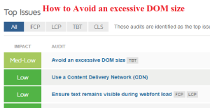
Avoid an Excessive DOM Size How to Optimize Website Performance 2023

Avoid an Excessive DOM Size: How to Optimize Website Performance 2023

Avoid an Excessive DOM Size: How to Optimize Website Performance 2023 In this post, we will explore how to Avoid an Excessive DOM Size and explore effective strategies to optimize it. In the fast-paced world of web development, user experience and performance are paramount. One of the critical factors affecting website performance is the Document Object Model (DOM) size. An excessive DOM size can lead to slow page loading, increased memory consumption, and a subpar user experience. let’s know How to Avoid an Excessive DOM Size before knowing how to Avoid an Excessive DOM Size ? we should know What is the DOM? first What is the DOM? let’s clarify what the Document Object Model (DOM) is and why it matters. The DOM is a programming interface for web documents. It represents the page so that programs can change the document structure, style, and content dynamically. When a web page loads, the browser constructs a DOM representation of that page, which allows JavaScript to interact with and manipulate the content. The DOM is structured as a tree, with each element on the page represented as a node. This tree structure is essential for rendering the web page, handling user interactions, and making updates in real-time. However, it can become problematic when the DOM size becomes excessive. The Consequences of an Excessive DOM Size Slower Page Loading Times One of the most significant consequences of an excessive DOM size is slower page loading times. When the browser needs to parse and render a large DOM, it requires more time and resources. This results in a sluggish user experience, particularly on devices with limited processing power or slow internet connections. Increased Memory Consumption A bloated DOM also consumes more memory, which can lead to performance issues, especially on mobile devices. When memory usage exceeds a certain threshold, browsers may start to unload or pause scripts, causing parts of the page to become unresponsive. Reduced Accessibility Excessive DOM sizes can negatively impact web accessibility. Screen readers and assistive technologies rely on the DOM to provide information about the page’s structure and content to users with disabilities. A cluttered and convoluted DOM can make it difficult for these technologies to interpret and convey the content effectively. Poor SEO Performance Search engine optimization (SEO) is another area where an excessive DOM size can have adverse effects. Search engines may struggle to index and rank pages with complex and oversized DOM structures. This can lead to lower search engine rankings and decreased visibility in search results. Now that we understand the consequences of an excessive DOM size, let’s explore some practical strategies to avoid it. Strategies to Avoid an Excessive DOM Size Efficient HTML Markup Start by creating clean and efficient HTML markup. Use semantic HTML elements and structure your documents logically. Avoid unnecessary nesting of elements, excessive divs, and non-semantic tags. The goal is to keep the HTML as simple and concise as possible. htmlCopy code <!– Example of clean, semantic HTML –> <header> <h1>Main Heading</h1> <nav> <ul> <li><a href=”#”>Home</a></li> <li><a href=”#”>About</a></li> <li><a href=”#”>Services</a></li> </ul> </nav> </header> Limit the Use of Frameworks and Libraries While JavaScript frameworks and libraries can be powerful tools for building dynamic web applications, they can also contribute to DOM bloat. Limit the use of unnecessary libraries and consider using vanilla JavaScript when possible. Additionally, be cautious when using libraries that generate complex DOM structures, as they can quickly lead to an excessive DOM size. Lazy Loading and Pagination Implement lazy loading and pagination for content-heavy websites. Lazy loading delays the loading of non-essential content until it’s visible in the user’s viewport. Pagination divides content into smaller, more manageable sections, reducing the initial DOM size. These techniques can significantly improve page loading times and user experience. Avoid Unnecessary DOM Manipulations Excessive DOM manipulations can lead to a bloated DOM. Minimize unnecessary updates and changes to the DOM by batching operations and using efficient algorithms. When making multiple changes to the DOM, consider using Document Fragments to perform off-DOM manipulations and then update the DOM in a single step. javascriptCopy code // Example of using Document Fragments const fragment = document.createDocumentFragment();for (let i = 0; i < 1000; i++) { const listItem = document.createElement(‘li’); listItem.textContent = `Item ${i}`; fragment.appendChild(listItem); }// Append the fragment to the DOM in a single step document.getElementById(‘myList’).appendChild(fragment); Optimize Images and Media Large images and media files can significantly contribute to an excessive DOM size. Optimize images for the web by using appropriate formats (e.g., WebP for photos) and compressing them without sacrificing quality. Implement responsive image techniques to serve appropriately sized images based on the user’s device and screen size. Remove Unused Elements Regularly audit your website for unused or obsolete elements in the DOM. These elements can accumulate over time and contribute to an excessive DOM size. Remove or refactor code that is no longer necessary for the functioning of your site. Use Browser Developer Tools Browser developer tools provide valuable insights into your page’s DOM and performance. Use tools like the browser’s built-in DOM inspector and performance profiler to identify and diagnose DOM-related issues. These tools can help you pinpoint areas that need optimization. Minify and Compress Resources Minify your CSS and JavaScript files to reduce their file size. Additionally, enable gzip or Brotli compression on your server to compress text-based resources before they are sent to the client. Smaller resource files result in a smaller initial DOM size. Conclusion In the ever-evolving landscape of web development, optimizing website performance remains a top priority. Avoiding an excessive DOM size is a critical step in achieving faster page loading times, better user experiences, and improved search engine rankings. By following the strategies outlined in this post, you can ensure that your web projects are lean, efficient, and responsive, ultimately benefiting both your users and your website’s success. So remember, always strive to “Avoid an excessive DOM size” to unlock the full potential of your web applications Friends, you have just read the post “Avoid an Excessive

Avoid an Excessive DOM Size: How to Optimize Website Performance 2023 Read More »

Scroll to Top